
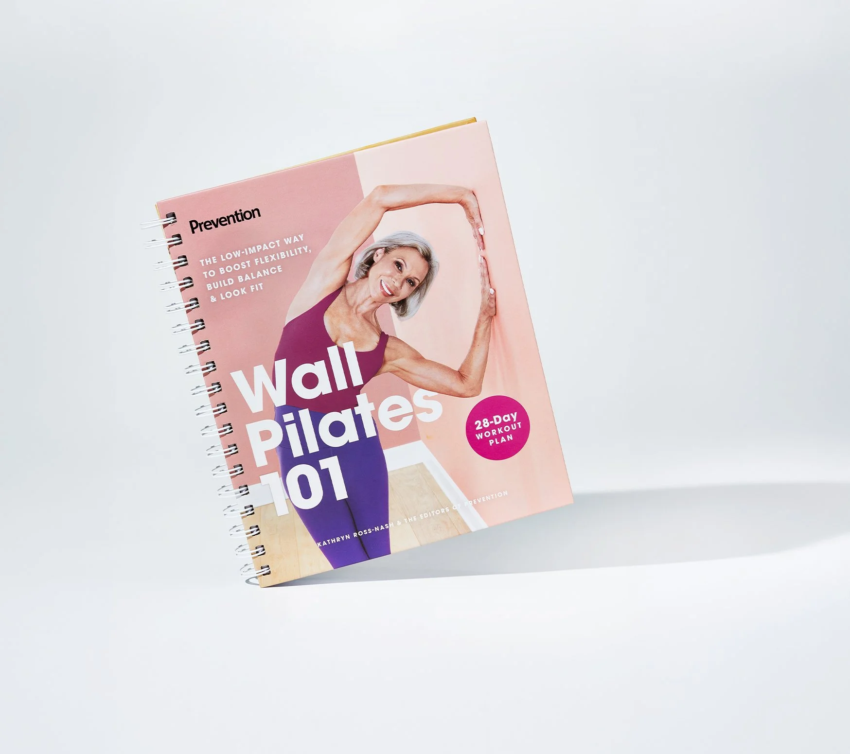
Wall Pilates 101
HEARST MAGAZINES
Design
The four-column spread system starts with an at-a-glance overview of the three levels of progression, followed by detailed step-by-step photography and instructions. Color and typographical weight contrast are used to callout key instructions and pacing between detailed movements.
Role Senior Designer/Art Director
Scope Product Design, Marketing, Photo Art Direction
Team Creative Consumer Group, Hearst Magazines
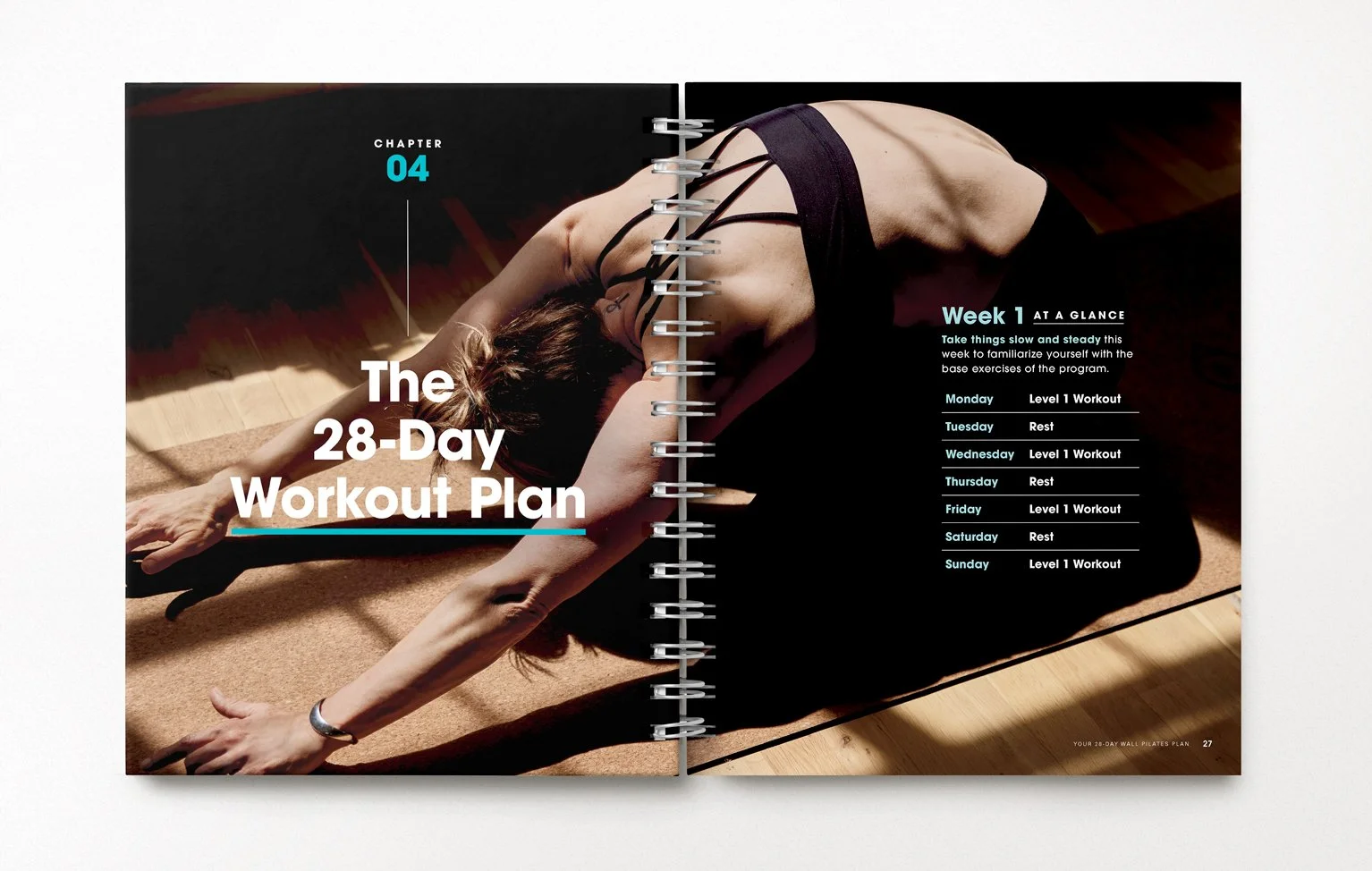
Wall Pilates is a form-driven practice, and the fitness plan required a high volume of photography and precise instructions for the progressions of the exercises. Working on Prevention at Hearst's Creative Consumer Group, I built a design system to carry that density, while keeping it open and airy to reflect both the brand and the accessibility of the fitness plan. Center-aligned typography treatment throughout was a nod to the balance and form of pilates.